East Shore Industries rebrands as ESI.
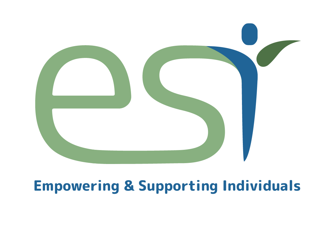
East Shore Industries in Algoma, recently underwent a rebrand to better communicate their mission and their strengths. The new acronym stands for "Empowering and Supporting Individuals" which is a focus for the organization as it helps its clients gain skills, confidence, independence and self- determination. The new name is accompanied by a new logo which highlights the independence of the individual. With calming blue and green colors, the logo incorporates a jubilant persona icon as the letter "i" to further communicate the success and transition of ESI's clients.

ESI's rebrand did not just stop at a new logo. I created advertisements, billboards, and designed the look of what their new website would be like.


